On Sunday, April 23, the Kuali Financial System (KFS) will undergo an upgrade that will update the look and feel of the system. While all basic functions will remain the same, the appearance of the KFS Requisition screen, where you enter delivery and account information, will change.
The most significant differences you will notice:
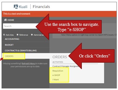
- The e-SHOP link on the KFS Main Menu has been replaced by a permission-based menu on the left.

- You will access e-SHOP from Orders or by using the search box.

- e-SHOP will open in a new tab that will improve the use of screen space and eliminate the double scroll bar.
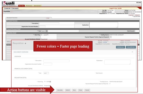
- Gray shading and tabs have been removed to improve readability and screen loading.
- Action buttons remain visible so that you no longer need to scroll to the bottom of the page.

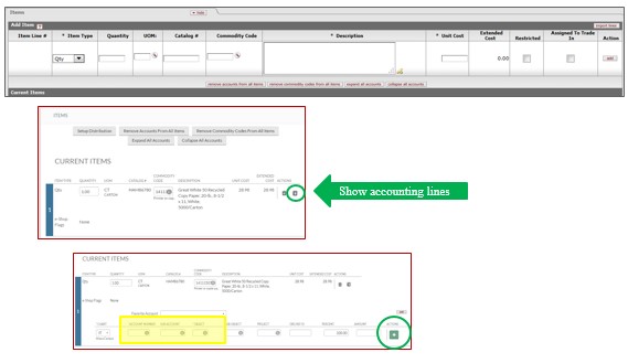
- Accounting buttons have been moved to the right of the line items, and the "add" button has been replaced with a plus (+) sign.

The following training materials have been updated and are published on our e-SHOP Training page.

