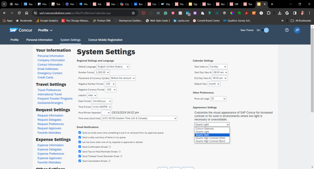
On April 10, SAP Concur will activate its new Fiori with Horizon visual theme family to improve consistency across its products and provide a more inclusive, accessible experience for everyone. With this theme, you can choose from high-contrast, dark, or light modes on the web and light and dark modes on the SAP Concur mobile app. Menus are also compacted into a single location.
On the way later this year are changes to profile options for better gender inclusivity and a new user interface for the Travel module that will align with the changes implemented in 2022 to the Expense and Request modules.
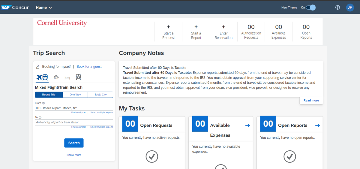
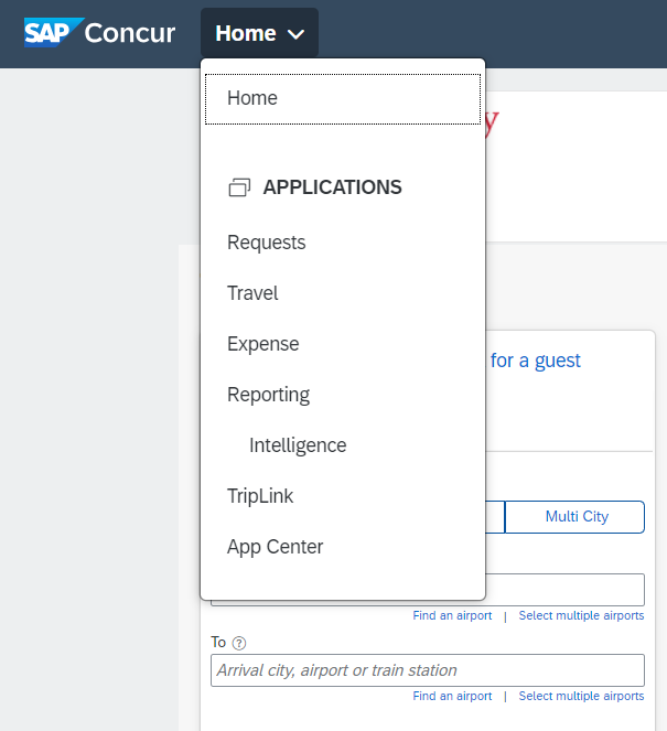
Right away, you may notice larger, cleaner fonts, buttons, and generally more space between page elements. The horizontal menu has been moved to a vertical menu in the upper-left corner.

The menu contains all the links you need to access the same services you’ve been using.

In the upper-right corner of the Concur window, a question mark symbol represents the help section, and the profile section is represented by a circle containing your initials.
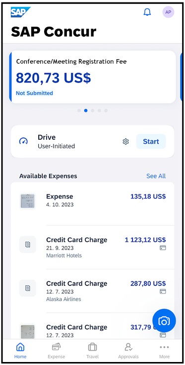
On the mobile app:


Changing your theme on the Concur website will not impact your mobile app experience. To change it on mobile:
You can access the Accessibility options, like high-contrast fonts, through the Accessibility menu in the iOS or Android device Settings.
